How to create an effective structured layouts presentation for clients?
December 09, 2014
There are many problems which disturb us and we don’t know how to solve them. There are many solutions which we don’t know how to apply and use correctly. John Conway’s invention of a new design for umbrella was immediately rejected and it lasted for several decades, but now we actively use the umbrellas of his design. We have the similar problem. Upon initial estimate it should be supposed that 80% of web designers and web developers do not use the ready-made solution for two reasons. The first reason is that they don’t know that such solutions exist. The second reason is that they don’t know how to use them. I propose to deal with these problems and get to know their solutions.
Many articles of series “How to make a website design development profitable?” (parts 1, 2, 3, 4) are devoted to the problem of which ~40% of web designers don’t know and ~40% of them ignore it. This problem is the structured presentation of the layouts.
The text below was written by the service head designer Sergey Kyrdyomov at my request. I asked him to write the way he sees this process, to share his experience and give examples. In reply to this, he became shy because he had never done this, but I was persistant and he agreed. Sergey insisted on publishing his text without changes, corrections and addition of any advertisement.
Hello, my name is Sergey. First of all I want to say that login in (m) maquetter will take a minute. After that you will get a free package. It includes the complete service functionality. The difference between free and paid software packages is the number of projects designed in these packages.

So, we have logged, what’s next? Let’s look at the example. Let’s assume that you have a design of Internet shop. Create a project with appropriate name. Automatically go to the project and name the first folder – “Main”.
Here I would like to make a small notice concerning the names: give reasonable names to folders and files. All folders and files should be named consequently and clearly so that the client can understand the page content on the basis of a file.
Let’s go back to our project. “Main” folder will contain the layouts of the main page – the main page with login or without it, all possible pop-down menus, for example with a choice of city, shop catalogue etc.
Then “Entrance” folder will contain all layouts required for entrance to a web site – login page, authorization page, password recovery, variants of validated and non-validated forms etc.
The project will containthe following folders: “Catalogue”, “Goods” and “Goods in details” etc. Many people ask:” What’s the difference if the “Entrance” folder will be not the second folder, but the last?” There is no difference, but for the client it will be much clearer and more pleasant to get acquainted with the project design if he sees the structured and logical sequence of the layouts. Thereby, when you press right on the arrow or button, the layout will consistently move on theweb site at a trajectory you’ve planned. This helps the client to understand what happens on the web site and as a result he will ask fewer questions. So you will save much time.

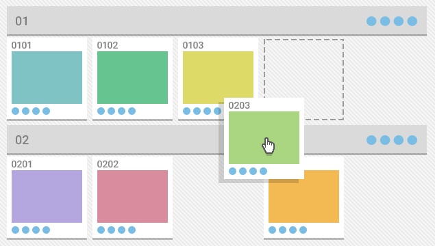
The clear structure can be arranged in (m) maquetter. This service allows changing positions of both certain layouts and the folders which can be performed by simple dragging. We can rename each downloaded layout and give the description if necessary.
Automatic numbering of all folders and layouts is quite significant for effective presentation in (m) maquetter service. So, our project will have the following numbering - “01 Main”, the pages in this folder: “0101 with login”, “0102 without login”, “0103 pop-down menu of the catalogue”, “0104 popup with a choice of city”... “02 Entrance” folder and the pages in it: “0201 login page”, “0202 authorizationpage”, “0203 password recovery”…
That is, instead of writing message to the client with the following text: “Review the changes in “Main” folder for the login page and in “Entrance” folder for the password recovery page and loginpage” it will be enough to write: “Review changes for 0101, 0203 and 0201”. You must admit that it is much easier and quicker. Having tested this, we understand that the clients ask questions neither about the layout names nor how to view them correctly.

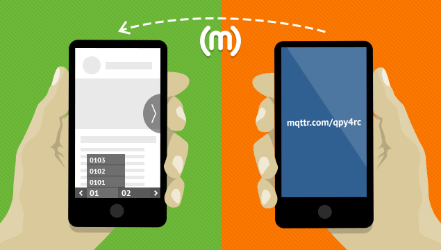
In addition, instead of long URL link, we can copy a short link to the project and to each layout. (link/#0201), for example http://mqttr.com/example#0103. During the whole period of working time on the project, the link remains the same and allows sending it in SMS. In its turn, the client can immediately follow this link because the service supports all browsers and devices.
P.S. You don’t know what toadd?! Don’t say anything – just use the service! If you have questions to Sergey, write them here with a markup “for Sergey web designer”.
